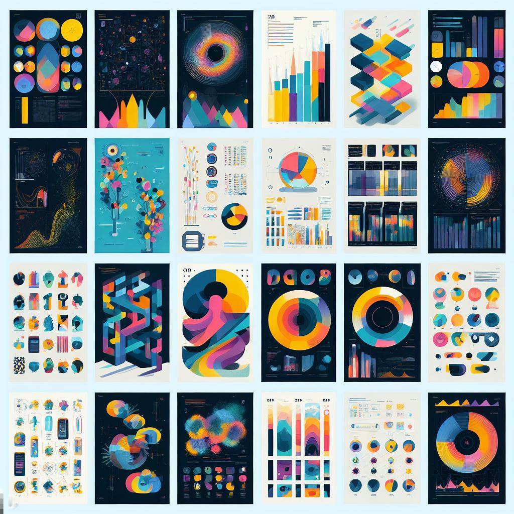
DData visualization is the art and science of transforming data into visual forms that communicate insights, patterns, and stories. Data visualization can help startups to showcase their value proposition, attract investors, engage customers, and grow their business.
But how can you use data visualization to tell compelling stories that resonate with your audience? Here are some tips and best practices to follow:
1. Know your audience and your goal.
Before you start designing your data visualization, you need to understand who you are talking to and what you want to achieve. Different audiences may have different levels of familiarity with your topic, different expectations, and different preferences. You need to tailor your data visualization to suit their needs and interests. For example, if you are pitching your startup idea to potential investors, you may want to focus on the market opportunity, the problem you are solving, and the traction you have achieved. If you are presenting your product features to potential customers, you may want to highlight the benefits, the user feedback, and the competitive advantage.
2. Choose the right type of visualization.
Depending on your data type, your message, and your goal, you need to select the most appropriate type of visualization that can convey your story effectively. There are many types of visualizations to choose from, such as bar charts, line graphs, pie charts, maps, histograms, scatter plots, etc. Each type has its own strengths and weaknesses, and some may be more suitable for certain scenarios than others. For example, bar charts are good for comparing categories within a single measure, line graphs are good for showing trends over time, pie charts are good for showing proportions of a whole, maps are good for showing location-specific data, etc. You can also combine different types of visualizations to create a dashboard or a narrative that shows multiple aspects of your data.
3. Use coherent color palettes.
Color is one of the most powerful elements of data visualization.it can attract attention, evoke emotions, create contrast, and highlight patterns. However, color can also be misleading, distracting, or confusing if used improperly. You need to choose a color palette that is consistent with your brand identity, your message, and your audience’s preferences. You also need to use color sparingly and strategically, avoiding too many colors or colors that clash or blend together. You can use color to encode different categories or values of data, to emphasize important points or outliers, or to create a visual hierarchy or direction.
4. Use succinct labels and titles.
Labels and titles are essential for providing context and clarity to your data visualization. They help your audience to understand what they are looking at, what the data represents, and what the main takeaway is. However, labels and titles should not be too long or too detailed, as they can clutter the visualization or distract from the main message. You need to use concise and descriptive words that capture the essence of your data and your story. You also need to use consistent fonts and sizes that match your brand style and your visualization type.
5. Apply visual hierarchy and direction.
Visual hierarchy is the principle of arranging elements in a way that implies importance or order. Visual direction is the principle of guiding the eye movement of the viewer along a path or a sequence. Both principles are crucial for creating a clear and engaging data story that flows logically and smoothly. You can use various techniques to create visual hierarchy and direction in your data visualization, such as size, shape, position, alignment, spacing, color, contrast, etc. For example, you can use larger or brighter elements to draw attention to key points or conclusions; you can use shapes or icons to differentiate categories or types of data; you can use position or alignment to create groups or clusters; you can use spacing or borders to create separation or connection; you can use color or contrast to create focus or contrast; etc.
6. Create illustrations and high-quality images.
Illustrations and images are another way of enhancing your data visualization and making it more appealing and memorable. Illustrations and images can add context, emotion, personality, and creativity to your data story. They can also help you explain complex concepts or processes in a simple and intuitive way. However, illustrations and images should not be used randomly or excessively; they should be relevant to your data and your message; they should be consistent with your brand style; they should be high-quality; they should not interfere with the readability or accuracy of your data.
7. Be observant and analytical.
One of the best ways to learn how to create effective data visualizations is to observe and analyze how others do it. You can harvest inspirations from other works of art and graphic design solutions that catch your eye or impress you with their storytelling power1. You can also look for examples of data visualizations that relate to your industry or topic2. You can study how they use different types of visualizations3, how they use color palettes4, how they use labels and titles5, how they use visual hierarchy and direction6, how they use illustrations and images7, etc. You can also look for feedback or reviews from other viewers or experts to see what works and what doesn’t.
8. Be creative and innovative.
While observing and analyzing other data visualizations can help you learn from the best practices and avoid the common pitfalls, you should not copy or imitate them blindly. You should also try to be creative and innovative in your own data storytelling, as that can help you stand out from the crowd and create a lasting impression on your audience. You can experiment with different types of visualizations, different color palettes, different labels and titles, different visual hierarchy and direction, different illustrations and images, etc. You can also try to add some interactivity or animation to your data visualization, as that can make it more engaging and immersive for your audience8.
9. Test and iterate.
Creating a data visualization is not a one-time process; it is an iterative process that requires testing and refining until you achieve the best results. You need to test your data visualization with your target audience, as they are the ultimate judges of whether your data story is clear, compelling, and convincing. You need to collect feedback from them on various aspects of your data visualization, such as the data quality, the visualization type, the color palette, the labels and titles, the visual hierarchy and direction, the illustrations and images, etc. You need to analyze the feedback and identify the strengths and weaknesses of your data visualization. You need to make changes and improvements based on the feedback and test again until you reach your goal.
10. Be honest and ethical.
Last but not least, you need to be honest and ethical in your data storytelling. You need to respect the integrity and accuracy of your data; you should not manipulate or distort it to fit your agenda or bias; you should not omit or hide important information or context; you should not use misleading or deceptive visual techniques; you should not plagiarize or infringe on others’ intellectual property; etc. You need to be transparent and accountable for your data sources, methods, assumptions, limitations, etc. You need to acknowledge any errors or uncertainties in your data or analysis. You need to follow the ethical standards and guidelines of your industry or profession.
Data visualization is a powerful tool for startups to tell compelling stories that can inspire, persuade, and influence their audience. By following these tips and best practices, you can create data visualizations that are not only beautiful but also meaningful and effective.