


How to Design Product Packaging for Indian F&B Startups
Designing product packaging for Indian Food and Beverage (F&B) startups is a high-stakes balancing act.
Your packaging has to do two massive jobs simultaneously: command attention on a crowded retail shelf (or quick-commerce app) and strictly satisfy the Food Safety and Standards Authority of India (FSSAI) packaging and labeling regulations.
If you compromise on design, your product won’t sell. If you compromise on compliance, your inventory can be seized, or you can face heavy penalties.
1. The Mandatory FSSAI Layout Checklist
The back-of-pack (BOP) or side panels must follow a strict informational hierarchy. When mapping out the flat dieline in Adobe Illustrator or CorelDRAW, ensure the following elements are present, clear, and meets minimum font size requirements (typically 1mm to 3mm depending on the size of the principal display panel).
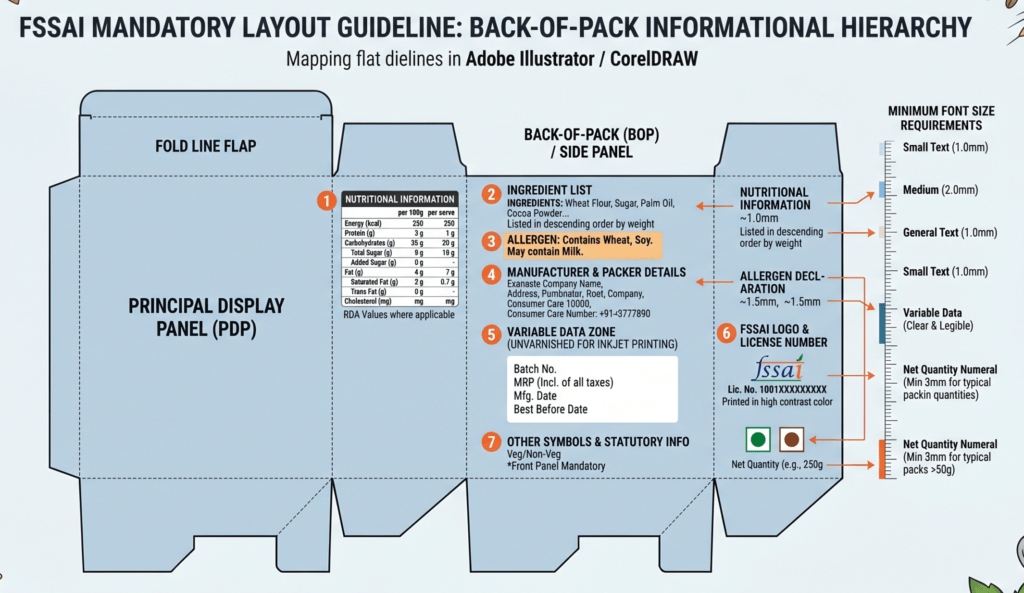
The Principal Display Panel (PDP): This is your front face. It must clearly display the Name of the Food, the Veg/Non-Veg Logo (a green filled circle inside a square for vegetarian, or a brown triangle inside a square for non-vegetarian), and the Net Quantity.
Nutritional Information Panel: This table must explicitly state values per 100g or 100ml of the product, as well as per serve contribution to the Recommended Dietary Allowance (RDA). It must cover:
Energy value (kcal)
Protein, Carbohydrates (with separate listing for total sugars and added sugars), and Fats (saturated fat, trans fat, and cholesterol)
Any nutrients for which a nutrition claim is made.
The FSSAI Logo & License Number: The logo and the 14-digit license number must be printed in a color that highly contrasts with the background.
Ingredient List & Allergens: Ingredients must be listed in descending order of their weight or volume at the time of manufacture. Explicit allergen declarations (e.g., “Contains Wheat, Soy”) must be placed right below the ingredient list in bold text.
Manufacturer/Packer Details: Complete name and address of the manufacturing unit, packer, or importer, alongside a dedicated consumer care cell number and email ID.
The Principal Display Panel (PDP): This is your front face. It must clearly display the Name of the Food, the Veg/Non-Veg Logo (a green filled circle inside a square for vegetarian, or a brown triangle inside a square for non-vegetarian), and the Net Quantity.
Nutritional Information Panel: This table must explicitly state values per 100g or 100ml of the product, as well as per serve contribution to the Recommended Dietary Allowance (RDA). It must cover:
Energy value (kcal)
Protein, Carbohydrates (with separate listing for total sugars and added sugars), and Fats (saturated fat, trans fat, and cholesterol)
Any nutrients for which a nutrition claim is made.
The FSSAI Logo & License Number: The logo and the 14-digit license number must be printed in a color that highly contrasts with the background.
Ingredient List & Allergens: Ingredients must be listed in descending order of their weight or volume at the time of manufacture. Explicit allergen declarations (e.g., “Contains Wheat, Soy”) must be placed right below the ingredient list in bold text.
Manufacturer/Packer Details: Complete name and address of the manufacturing unit, packer, or importer, alongside a dedicated consumer care cell number and email ID.
2. Design Strategy: Aesthetics vs. Dense Data
To keep a premium look while including a mountain of statutory text, premium brands rely on smart visual structuring.
Multi-Tier Onboarding: Put your brand story, hero graphics, and key dietary USPs (like Gluten-Free or High Protein) on the front panel. Keep the typography clean and give the elements room to breathe.
The “White Block” Strategy: Always leave a dedicated, completely unvarnished matte white zone on your artwork for variable data. This is where manufacturing facilities overprint time-sensitive information like the Batch Number, MRP (inclusive of all taxes), Manufacturing Date, and Best Before date using automated inkjet coding machines. If this area isn’t unvarnished, moisture or refrigeration frost can cause the ink to smudge or bleed.
Color Blocking for Variants: If you are launching a product line with multiple flavors (such as a line of millet-based mueslis or traditional sweets), keep the structural base layout identical but switch up the accent colors and hero imagery. This builds brand recognition while helping the customer instantly differentiate flavors on the shelf.
3. Selecting the Right Materials
Your material choice directly impacts both shelf life and print quality:
Stand-Up Pouches (Zipper): Best used for muesli, granolas, snacks, and coffee. These provide an excellent front-facing canvas area for branding and stand upright independently on retail shelves to maximize visibility.
Monolayer / Laminate Films: Best used for highly perishable products, sweets, and dairy. These deliver high barrier properties against oxygen and moisture, which is absolutely crucial for preserving freshness and keeping oils from seeping through the artwork.
Rigid Boxes with Inserts: Best used for premium items like dry fruits and traditional sweets (such as Kalakand). This setup delivers a luxury unboxing experience for the consumer while physically protecting fragile food geometry during transit.
FSSAI Packaging & Font Compliance Calculator
Determine statutory layout dimensions and minimum font scales based on product packaging footprints.